The Psychology of Color:
How Colors Influence Our Mood and Well-being
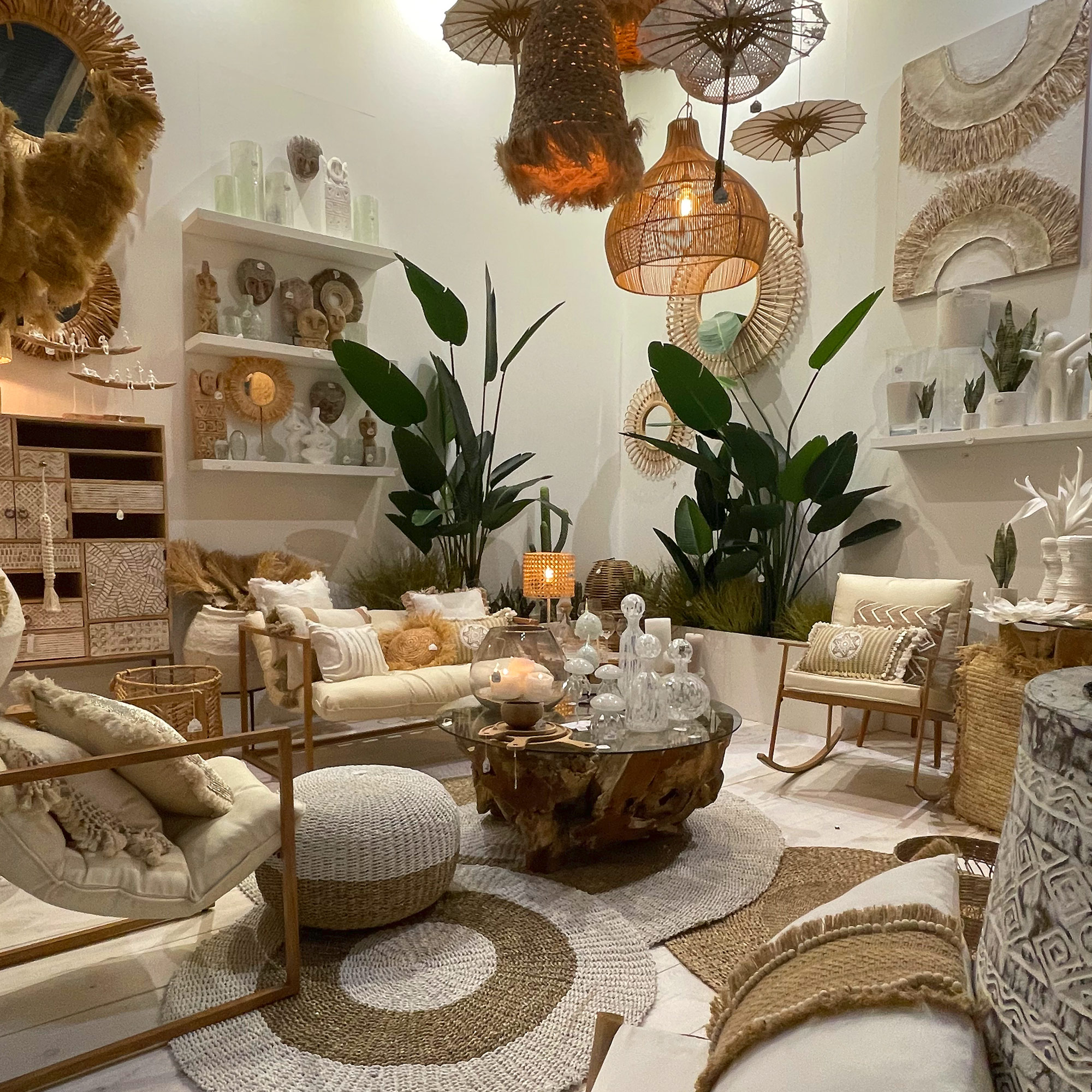
Today, I would like to share with you this theory of how the color influences our lives and how to make the most of in when it comes to Interior Design. Besides the lack of solid scientific proof, the psychological effect of color has become a hot topic in Interior Design due to the use of this powerful tool with the aim of create certain atmosphere in the different rooms of our homes.
So what do the colors mainly transmit?
Let’s discover one by one the main associated feelings and the ideal uses of color:
WHITE: this color often evocates the sense of modernity, clean and open space. This is the best color choice if we want to create a minimalistic ambiance. Combine it with multiple layers of white and your space will look more spacious, cleaner, and fresh, this tone is ideal for small spaces and to make the ceilings look higher.
BLACK: My favorite color and mainly recognized as the icon of luxury, this color emanates the sensation of power and mystery, easy to combine with almost everything I found it as the most powerful tone of the palette, a must for the designers and a dangerous weapon if you can’t control the right dose of it. Sophisticated and intimate, the black is my secret to make every room look richer, deep and glamourous.
BLUE: This calming color evocates the senses of stability, safety and peace, ideal for bedrooms and bathrooms, the serenity of this tone helps to clear the mind and unplug after a long day. I always suggest using the pastel and soft versions for bedrooms and slightly more intense shades for the living areas. Moreover, remember to be careful with the intensity of the blue tone, as the darkest versions can turn a room into cold and not welcoming space.
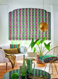
RED: Bold, powerful, brave, and also the symbol of romanticism, the red color invites us to interact and get close to each other, therefore this color is ideal to social areas as the dining or living room. This Christmassy and festive color its known (for the color therapy believers) as the blood circulation activator, a deeply emotional color that brings warmth even to the coldest winter.
PURPLE: This versatile color can offer opposite vibes to a room depending on what version of purple are we going for. If we pick the dark and deep purple, we will be creating a dramatic and luxurious effect, a royal appeal, elevated to its maximum if this powerful color is used in a velvet fabric or as the paint for an accent wall surrounded with any classic or gold piece. In exchange, if we go for a light and washed version, we will bring exact the opposite feeling to the room, as this color will provide calm, peace and a full sense of relax. These soft versions of purple are ideal for bedrooms or areas of rest.
YELLOW: Happy color, ideal for kitchens, this color evocates the sun light and creates a joyful and invigorating sensation. Ideal for a breakfast area or an entrance hall as it creates an expansive sensation. Fill your home with energetic and enthusiastic vibes by adding bright yellow accents in the décor or by the use of an accent wall.
PINK: Opposite to the red effect, the pink color tends to increase the feelings of love and calm. The more time that we spend in a pink room, more calmed we feel. The pastel version of this tone is an excellent choice for bedrooms, especially for the little ones, as it tends to promote softness. In the other hand, the ash versions of pink can be excellent allies to create elegant and classy spaces, for example, an ash rose wallpaper with silk texture can be a very stylish accent wall for a living area.
As seen, the task of choosing a color scheme for a room can be a challenge as they can have a strong influence in our mood and completely define the style concept, so if you feel that you might need help, we invite you to contact us and book an appointment por personalized advise. We can help you to make you home or business a reflection of your taste and personality and generate the desired atmosphere.

Estefani Batista
Partner – Interior Designer
(+34) 637 493 356
(+34) 952 130 841
Centro Comercial Guadalmina IV, Local 92, primera planta.
29670, Guadalmina Alta, Marbella.